This post originally appeared on the site of CGC’s campaign for a federal Green Bank.
In today’s column, Amy Harder at Axios highlights “the most important boring chart out there.” Here it is:
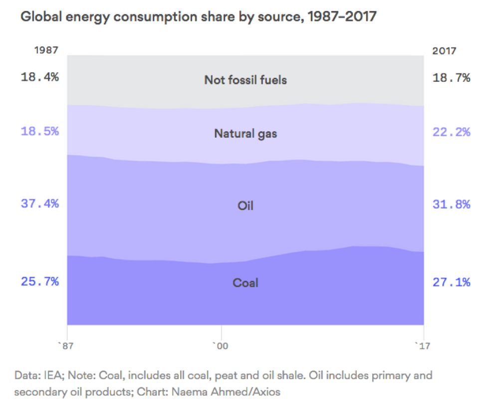
The chart is “boring” in that it’s almost completely static, showing little change in the global energy mix over the course of three decades. And it’s important in that it shows the magnitude of the challenge ahead to avoid the harmful consequences of climate change. Until these numbers change, the climate crisis will continue to worsen.
How can this be, when it seems that we’re constantly reading about advances in renewable energy? The buildout of renewable energy for power generation has accelerated, but so has the demand for power. Energy use for transportation and industry has also increased, without becoming cleaner at the same rate that the power sector has. Some countries, primarily developed countries, have slightly reduced their emissions, while emerging economies have increased their emissions.
Despite major changes in specific sectors and regions, we end up with a total global picture that’s remarkably stable. As the column states:
“Renewable electricity (which is the primary use for wind and solar) is often being added on top of instead of in lieu of fossil fuels, particularly in Asia’s rapidly growing economies.”
This high-level view provides a sobering chaser to positive indicators like lasts week’s move by Moody’s to downgrade the ratings of North American coal, and shows why ambitious policies like a National Climate Bank must focus on replacing fossil-fuel energy use (rather than just meeting new demand) in order to move these numbers away from stasis.
For more, read Amy Harder’s full insightful column in Axios here.